CSSだけでちいかわを作ってみた
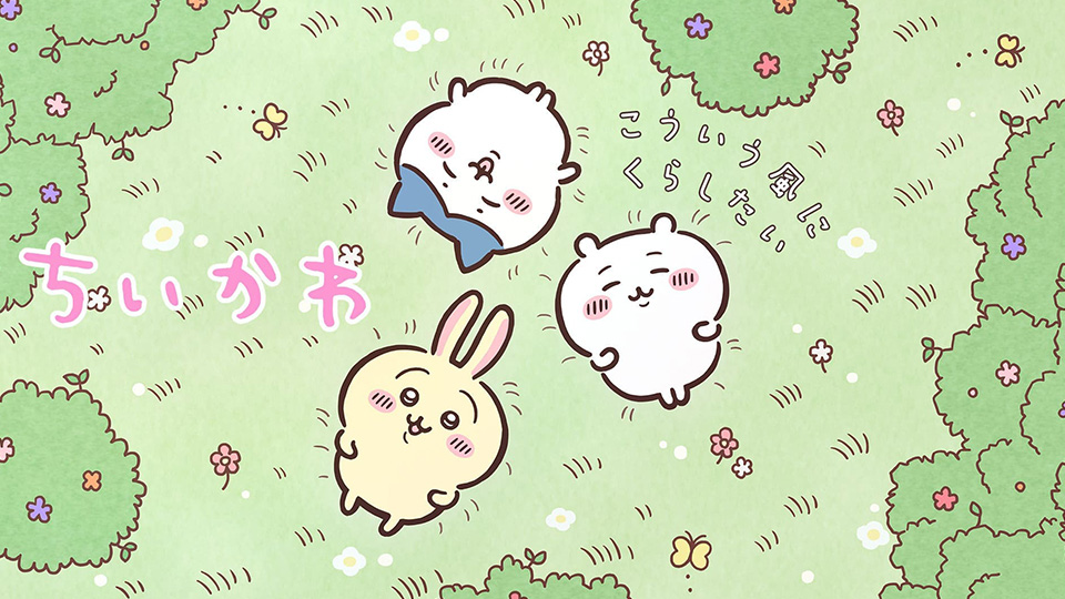
ちいさくてかわいいやつをCSSのみで作ってみました。
目次
PureCSS ちいかわ
See the Pen PureCSS ちいかわ by Leo_8192 (@Leo_8192) on CodePen.
うーん、これはかわいい。
ちいかわのソースコード
これいる?
HTML
<div class="tk_base">
	<div class="tk_ear_l tk_ear"></div>
	<div class="tk_ear_r tk_ear"></div>
	<div class="tk_face">
		<div class="tk_eyebrow_l tk_eyebrow"></div>
		<div class="tk_eyebrow_r tk_eyebrow"></div>
		<div class="tk_eye_l tk_eye">
			<div class="tk_eyeball_1"></div>
			<div class="tk_eyeball_2"></div>
		</div>
		<div class="tk_eye_r tk_eye">
			<div class="tk_eyeball_1"></div>
			<div class="tk_eyeball_2"></div>
		</div>
		<div class="tk_cheek_l tk_cheek"><i></i><i></i><i></i><i></i></div>
		<div class="tk_cheek_r tk_cheek"><i></i><i></i><i></i><i></i></div>
		<div class="tk_nose"></div>
		<div class="tk_mouth_l tk_mouth"></div>
		<div class="tk_mouth_r tk_mouth"></div>
		<div class="tk_mouth_b"></div>
	</div>
	<div class="tk_face_ol"></div>
	<div class="tk_body"></div>
	<div class="tk_arm_l tk_arm"></div>
	<div class="tk_arm_r tk_arm"></div>
	<div class="tk_leg_l tk_leg"></div>
	<div class="tk_leg_r tk_leg"></div>
</div>
CSS
.tk_base{
	position: absolute;
	top: 50%;
	left: 50%;
	transform: translate(-50%,-50%);
	width: 200px;
	height: 220px;
}
.tk_base *{
	position: absolute;
}
.tk_face{
	top: 14px;
	left: 50%;
	z-index: 3;
	transform: translateX(-50%);
	border: 6px solid #422622;
	border-radius: 50% 50% 44% 44%;
	width: 190px;
	height: 134px;
	background: #FAF8F7;
}
.tk_eye{
	top: 44px;
	border-radius: 50%;
	background: #422622;
	width: 26px;
	height: 26px;
}
.tk_eye_l{
	left: 52px;
}
.tk_eye_r{
	right: 52px;
}
.tk_eye .tk_eyeball_1{
	top: 6px;
	left: 7px;
	border-radius: 50%;
	background: #fff;
	width: 10px;
	height: 8px;
}
.tk_eye .tk_eyeball_2{
	top: 18px;
	left: 11px;
	border-radius: 50%;
	background: #fff;
	width: 8px;
	height: 4px;
}
.tk_eyebrow{
	top: 36px;
	border-radius: 2px;
	width: 14px;
	height: 4px;
	background: #422622;
}
.tk_eyebrow_l{
	left: 60px;
	transform: rotate(-8deg);
}
.tk_eyebrow_r{
	right: 60px;
	transform: rotate(8deg);
}
.tk_cheek{
	top: 64px;
	border-radius: 50%;
	width: 32px;
	height: 26px;
	background: #FFC1C9;
}
.tk_cheek_l{
	left: 26px;
}
.tk_cheek_r{
	right: 26px;
}
.tk_cheek i{
	top: 7px;
	transform: rotate(20deg);
	background: #422622;
	border-radius: 2px;
	width: 3px;
	height: 11px;
}
.tk_cheek i:nth-child(1){
	left: 4px;
}
.tk_cheek i:nth-child(2){
	left: 10px;
}
.tk_cheek i:nth-child(3){
	left: 16px;
}
.tk_cheek i:nth-child(4){
	left: 22px;
}
.tk_nose{
	top: 74px;
	left: 50%;
	transform: translateX(-50%);
	border-radius: 50%;
	width: 8px;
	height: 8px;
	background: #422622;
}
.tk_mouth{
	top: 50px;
	border: 4px solid transparent;
	border-bottom: 4px solid #422622;
	border-radius: 50%;
	width: 18px;
	height: 30px;
}
.tk_mouth_l{
	left: 76px;
}
.tk_mouth_r{
	right: 76px;
}
.tk_mouth_b{
	top: 92px;
	left: 50%;
	transform: translateX(-50%);
	border-radius: 2px;
	width: 10px;
	height: 4px;
	background: #422622;
}
.tk_face_ol{
	top: 130px;
	left: 50%;
	z-index: 3;
	transform: translateX(-50%);
	border-radius: 0;
	width: 120px;
	height: 40px;
	background: #FAF8F7;
}
.tk_ear{
	top: 0;
	border: 6px solid #422622;
	border-radius: 50%;
	width: 16px;
	height: 20px;
	background: #FAF8F7;
}
.tk_ear_l{
	left: 38px;
	transform: rotate(-10deg);
}
.tk_ear_r{
	right: 38px;
	transform: rotate(10deg);
}
.tk_body{
	top: 112px;
	left: 50%;
	z-index: 1;
	transform: translateX(-50%);
	border: 6px solid #422622;
	border-radius: 40%;
	width: 120px;
	height: 80px;
	background: #FAF8F7;
}
.tk_arm{
	top: 134px;
	border: 6px solid #422622;
	border-radius: 46%;
	width: 10px;
	height: 20px;
	background: #FAF8F7;
}
.tk_arm_l{
	left: 22px;
	transform: rotate(4deg);
}
.tk_arm_r{
	right: 22px;
	transform: rotate(-4deg);
}
.tk_leg{
	top: 182px;
	border: 6px solid #422622;
	border-radius: 46%;
	width: 8px;
	height: 24px;
	background: #FAF8F7;
}
.tk_leg_l{
	left: 40px;
	transform: rotate(-4deg);
}
.tk_leg_r{
	right: 40px;
	transform: rotate(4deg);
}
割と細かく指定しています。地獄。
簡単に貼り付けられる
CSSのみで構成されているので、こんな風にブログに貼り付けるのも簡単です。かわいい。
デカい。でかきも。
動かしたらかわいい。
ちいかわを解体してみる
See the Pen PureCSS ちいかわ by Leo_8192 (@Leo_8192) on CodePen.
positionの指定を抜くとちいかわが崩壊します。気持ち悪い。
最後に
多分SVGで作ったほうが500倍くらい楽なので、CSSだけで何でも作ろうとするのはやめましょう。