【CSS】ブログ記事の見出しで使えそうなスタイル一覧作っといた
暇だったんで、ブログ記事やWebサイトの見出しに使えそうなスタイルを量産しておきました。こういうの作ってまとめておくと、後で自分で見返しやすいので便利なんですよね…
目次
ベースとなるHTML・CSS
See the Pen Untitled by Leo_8192 (@Leo_8192) on CodePen.
<div class="content">
<p>~~~</p>
<h1>色々な見出しパターンを紹介</h1>
<p>~~~</p>
</div>
h1{
  margin: 20px 0;
  color: #2f2f2f;
  font-size: 28px;
}
これをベースにh1をいじっていきます。
使用にあたっての注意事項
コピペでもある程度は問題無いと思いますが、文字サイズや色、余白やボーダーの太さ等はご自身のサイトに合わせて調整するのをオススメします。
あと、レスポンシブデザインのサイトで利用する場合は、メディアクエリーを付けてスマホ用にサイズ感を調整したスタイルも併記することを推奨します(特に文字サイズ周り)。
見出しデザイン14種類を紹介
左にボーダー
See the Pen 見出しパターン - 1 by Leo_8192 (@Leo_8192) on CodePen.
多分一番シンプルな装飾。使い勝手良し!
h1{
  padding: 4px 0 6px 12px;
  border-left: 4px solid #2f2f2f;
}
左にボーダー+背景色
See the Pen 見出しパターン - 2 by Leo_8192 (@Leo_8192) on CodePen.
これもよくある装飾。色を調整すればどんなサイトでも馴染みます。
h1{
  padding: 4px 12px 6px;
  border-left: 4px solid #2f2f2f;
  background: #ddd;
}
背景ストライプ
See the Pen 見出しパターン - 3 by Leo_8192 (@Leo_8192) on CodePen.
repeating-linear-gradientを使えば、CSSだけでボーダー背景が作れます。
h1{
	padding: 4px 12px 6px;
	background: repeating-linear-gradient(-45deg, #e5e5e5, #e5e5e5 5px, transparent 5px, transparent 10px);
}
吹き出し風
See the Pen 見出しパターン - 8 by Leo_8192 (@Leo_8192) on CodePen.
これもたまに見ますね。疑似要素を使えば割と簡単に作れます。
h1{
position: relative;
margin: 20px 0;
padding: 4px 12px 6px;
background: #ddd;
}
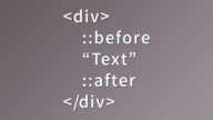
h1::before{
content: "";
position: absolute;
left: 30px;
bottom: -24px;
border: 12px solid transparent;
border-top: 12px solid #ddd;
width: 0;
height: 0;
}
めくれた表現
See the Pen 見出しパターン - 6 by Leo_8192 (@Leo_8192) on CodePen.
紙がめくれたような表現。めくれ部分の作り方は何通りかあるんですが、今回はグラデーションを使いました。
h1{
  position: relative;
  padding: 4px 12px 6px;
  background: linear-gradient(-45deg, transparent 12px, #ddd 12px);
}
h1::after{
  content: "";
  position: absolute;
  bottom: 0;
  right: 0;
  width: 18px;
  height: 18px;
  background: linear-gradient(-45deg, transparent 50%, #aaa 50.1%);
}
リボン
See the Pen 見出しパターン - 7 by Leo_8192 (@Leo_8192) on CodePen.
左右にネガティブマージンを設けて記事からはみ出させれば、リボンのような表現が出来ます。
h1{
  position: relative;
  margin: 20px -38px;
  padding: 4px 38px 6px 38px;
  background: #ccc;
}
h1::before,h1::after{
  content: "";
  position: absolute;
  bottom: -18px;
  width: 18px;
  height: 18px;

}
h1::before{
  left: 0;
  background: linear-gradient(45deg, transparent 50%, #aaa 50.1%);
}
h1::after{
  right: 0;
  background: linear-gradient(-45deg, transparent 50%, #aaa 50.1%);
}
タグ
See the Pen 見出しパターン - 10 by Leo_8192 (@Leo_8192) on CodePen.
タグみたいなデザイン。丸部分は白で塗りつぶしているので、記事の背景色が白じゃない場合は色を変えて対応しましょう。
h1{
  position: relative;
  padding: 8px 12px 10px 32px;
  border-radius: 1em 0 0 1em;
  background: #ddd;
}
h1::before{
  content: "";
  position: absolute;
  top: 50%;
  left: 12px;
  border-radius: 50%;
  width: 12px;
  height: 12px;
  background: #fff;
  transform: translatey(-50%);
}
左右にボーダー
See the Pen 見出しパターン - 4 by Leo_8192 (@Leo_8192) on CodePen.
flexと疑似要素を組み合わせれば左右にボーダーを引けます。ただ、文字数が多かったり画面幅が狭かったりするとちょっと線が短くて不格好なので、文字サイズやmin-widthを調整して使うのを推奨します。
h1{
  display: flex;
  justify-content: center;
  align-items: center;
}
h1::before,h1::after{
  content: "";
  flex-grow: 1;
  min-width: 1em;
  height: 1px;
  background: #2f2f2f;
}
h1::before{
  margin-right: 0.3em;
}
h1::after{
  margin-left: 0.3em;
}
左右に点線
See the Pen 見出しパターン - 5 by Leo_8192 (@Leo_8192) on CodePen.
borderではなくrepeating-linear-gradientを使うことで、点線の間隔を細かく制御出来ます。
h1{
  display: flex;
  justify-content: center;
  align-items: center;
}
h1::before,h1::after{
  content: "";
  flex-grow: 1;
  min-width: 1em;
  height: 1px;
  background: repeating-linear-gradient(90deg, #888, #888 10px, transparent 10px, transparent 15px);
}
h1::before{
  margin-right: 0.3em;
}
h1::after{
  margin-left: 0.3em;
}
下に小さなボーダー
See the Pen 見出しパターン - 14 by Leo_8192 (@Leo_8192) on CodePen.
疑似要素で作った線を下に置いただけのお手軽装飾ですが、よく見るデザインです。
h1{
  position: relative;
  margin: 20px -8px;
  padding: 4px 12px 20px;
  text-align: center;
}
h1::before{
  content: "";
  position: absolute;
  bottom: 0;
  left: 50%;
  width: 20%;
  height: 2px;
  background: #444;
  transform: translatex(-50%)
}
下に色が分かれているボーダー
See the Pen 見出しパターン - 9 by Leo_8192 (@Leo_8192) on CodePen.
これ最近けっこう見るんですけど、流行ってるんですかね?
h1{
  position: relative;
  padding: 4px 0 6px;
  border-bottom: 4px solid #ddd;
}
h1::before{
  content: "";
  position: absolute;
  bottom: -4px;
  left: 0;
  width: 33%;
  height: 4px;
  background: #aaa;
}
交差するボーダー
See the Pen 見出しパターン - 11 by Leo_8192 (@Leo_8192) on CodePen.
お洒落だけど使い所が少し難しそう。
h1{
  display: flex;
  align-items: center;
  position: relative;
  margin: 20px -8px;
  padding: 4px 20px;
  border-top: 2px solid #444;
  border-bottom: 2px solid #444;
}
h1::before,h1::after{
  content: "";
  position: absolute;
  top: -10px;
  width: 2px;
  height: calc(100% + 20px);
  background: #444;
}
h1::before{
  left: 8px;
}
h1::after{
  right: 8px;
}
鉤括弧
See the Pen 見出しパターン - 12 by Leo_8192 (@Leo_8192) on CodePen.
シンプルだけどけっこうお洒落なので、文字を読ませるのがメインのコンテンツで使えそうです。実用するときはもう少し上下の余白を広げたいかも?
h1{
  display: flex;
  justify-content: center;
  align-items: center;
  position: relative;
  margin: 20px -8px;
  padding: 4px 16px;
}
h1::before,h1::after{
  content: "";
  position: absolute;
  width: 20px;
  height: 20px;
}
h1::before{
  top: 0;
  left: 8px;
  border-top: 2px solid #444;
  border-left: 2px solid #444;
}
h1::after{
  bottom: 0;
  right: 8px;
  border-bottom: 2px solid #444;
  border-right: 2px solid #444;
}
大括弧
See the Pen 見出しパターン - 13 by Leo_8192 (@Leo_8192) on CodePen.
鉤括弧と同じ雰囲気なので、これも文字を読ませるコンテンツで採用してみたいですね。
h1{
  display: flex;
  justify-content: center;
  align-items: center;
  position: relative;
  margin: 20px -8px;
  padding: 4px 16px;
}
h1::before,h1::after{
  content: "";
  position: absolute;
  border-top: 2px solid #444;
  border-bottom: 2px solid #444;
  width: 10px;
  height: 100%;
}
h1::before{
  top: 0;
  left: 8px;
  border-left: 2px solid #444;
}
h1::after{
  bottom: 0;
  right: 8px;
  border-right: 2px solid #444;
}
最後に
見出しに過度な装飾を施すと肝心の文章が読みにくくなる恐れがあるので、やり過ぎには気をつけてほどほどにしておきましょう。
とりあえず使い勝手の良さそうなものを中心にまとめましたが、新しいスタイルを思い付いたり流行りのデザインがあったりしたら随時追加していく予定です。
以上。